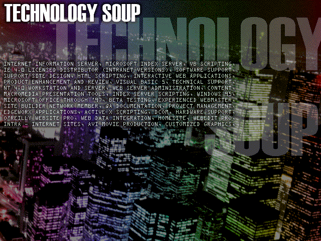
An old introduction image to a website. Careful word choice and careful typography using a monospaced typeface allowed letter-perfect justification of all included elements.
An old introduction image to a website. Careful word choice and careful typography using a monospaced typeface allowed letter-perfect justification of all included elements.
All content © HyperOptic Productions